1140px Wide - Fluid CSS Framework
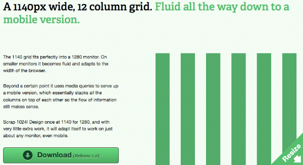
The 1140 grid is 12 column CSS framework which fits perfectly into a 1280 monitor. On smaller monitors it becomes fluid and adapts to the width of the browser. Beyond a certain point it uses media queries to serve up a mobile version, which essentially stacks all the columns on top of each other so the flow of information still makes sense.
Scrap 1024! Design once at 1140 for 1280, and with very little extra work, it will adapt itself to work on just about any monitor, even mobil. Because it’s all based off percentages, the gutters vary in size. But at full width the gutters are about 40px wide. Photoshop template of the grid at 1140px also availble for download. It works perfectly in Chrome, Safari, Firefox, IE7 & IE8. It works alright in IE6. IE6 doesn’t support max-width, so the grid doesn’t fix to 1140px.
Requirements: All modern browsers
Demo: http://cssgrid.net/
License: Creative Commons License


