Cool Image Roller Effect Using CSS
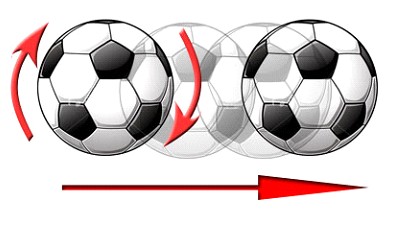
Today’s featured CSS tutorial comes courtesy of Gunjesh Kumar and what it will show you is how you can make an image appear like it’s rolling across to the other side of the screen or container. You’ll be achieving this effect using nothing but CSS and what better way to demonstrate this effect than by using an image of a ball.

You can see the CSS in action at the bottom of this demo page.
CSS
.roller
{
 width: 850px;
 height: 200px;
}
.roller img
{
 float: left;
 border-radius: 50%;
 width: 200px;
 height: 200px;
 transition: 1s Ease;
}
.roller:hover img
{
 transform: translate(630px, 0px) rotate(360deg);
}
The roller class is used to define the width and the height of the space that the ball will travel in; in this case, it’s 850px in width.
The border-radius is set to 50% to make the image round, while the transition time for the ball to finish the effect is set to 1 second. The transform property is the one responsible to achieve the rolling effect using translate and rotate. The value 360deg determines the amount of rotation the ball will perform whereas 630px is basically the distance the ball will travel from point A to point B.
HTML
<div>

 <img src="Images/css-effects/roll-ball.png" alt="Football" />

</div>
Hope you’ll have fun with this CSS hover effect!


