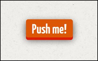
How to Create a Fancy 3D Button with CSS3

There are many CSS3 buttons techniques out there to choose from and developers nowadays supplement basic CSS3 properties with animation. One cool CSS3 button I’ve discovered is this fancy 3D button by simonpicos. It is a simple button with a clever use of box shadows and transition animation so it would look as if it’s really being pressed which adds more realistic feel.
This button works in browsers such as Chrome, Safar, Firefox and Opera.
Below are the following codes:
HTML
<link href='//fonts.googleapis.com/css?family=Yanone+Kaffeesatz:700' rel='stylesheet' type='text/css'>
<a href="#">Push me!</a>
CSS
body { background-image: url(http://subtlepatterns.com/patterns/ricepaper.png) }
a {
position: relative;
color: rgba(255,255,255,1);
text-decoration: none;
background-color: rgba(219,87,5,1);
font-family: 'Yanone Kaffeesatz';
font-weight: 700;
font-size: 3em;
display: block;
padding: 4px;
-webkit-border-radius: 8px;
-moz-border-radius: 8px;
border-radius: 8px;
-webkit-box-shadow: 0px 9px 0px rgba(219,31,5,1), 0px 9px 25px rgba(0,0,0,.7);
-moz-box-shadow: 0px 9px 0px rgba(219,31,5,1), 0px 9px 25px rgba(0,0,0,.7);
box-shadow: 0px 9px 0px rgba(219,31,5,1), 0px 9px 25px rgba(0,0,0,.7);
margin: 100px auto;
width: 160px;
text-align: center;
-webkit-transition: all .1s ease;
-moz-transition: all .1s ease;
-ms-transition: all .1s ease;
-o-transition: all .1s ease;
transition: all .1s ease;
}
a:active {
-webkit-box-shadow: 0px 3px 0px rgba(219,31,5,1), 0px 3px 6px rgba(0,0,0,.9);
-moz-box-shadow: 0px 3px 0px rgba(219,31,5,1), 0px 3px 6px rgba(0,0,0,.9);
box-shadow: 0px 3px 0px rgba(219,31,5,1), 0px 3px 6px rgba(0,0,0,.9);
position: relative;
top: 6px;
}
Check out its interactive DEMO to know further how this button works.


