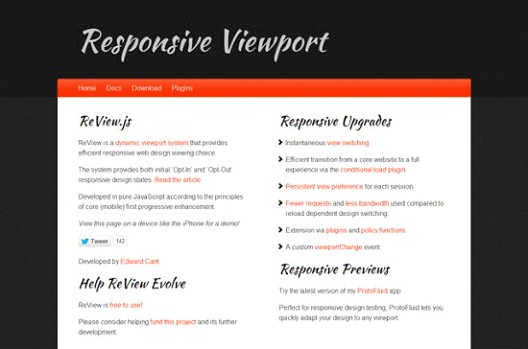
ReView.js: A Dynamic Viewport System in Responsive Designs

Nowadays, designing web layouts for different resolutions has become easier because of media queries. One of the useful tools available is ReView.js, which is a dynamic viewport system that provides efficient responsive web design viewing choices. It has an Opt-In and Opt-Out responsive design states and developed in pure JavaScript. It also allows users on mobile devices change from mobile to desktop view.
Denis Potschien shows you how to embed Review.js.
- To enable manual switching, integrate JavaScript into the head section of the wesite, after viewport definition:
<meta name="viewport" content="width=device-width, maximum-scale=1.0, minimum-scale=1.0" />
<script type="text/javascript" src="ReView.js"></script>
- Define a link for switching functionality anywhere in body-section of HTML document. This assigns class review to that link so ReView.js can find and process it.
<a href="/">ReView</a>
- You can modify by using HTML5 data attributes if you don’t like the default titles.
<a data-defaultText="Mobile Layout" data-coreText="Desktop Layout" href="/">ReView</a>
To know more about ReView.js, click HERE.


