Create Clean Business Web Layout in Adobe Photoshop
Today, lets try to design a smart, clean professional business web layout in Adobe Photoshop. You can use this layout for your personal website or for the business sites.
Final Product
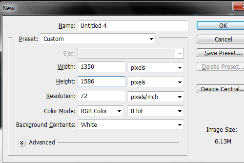
So, let’s start with a blank document of size 1350 x 1586px. It’s not necessary that you should strictly use the given document size. But this is a custome size for our target layout
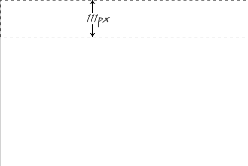
First of all, we have to start from the header section of the page. So, choose the selection tool and make a selection from the top of the document with a height of about 111px. This area will be our header which contains the Logo and the tagline.
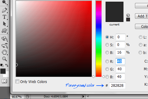
Make a new layer (ctlr + shift + N) and set the foreground color to #282828
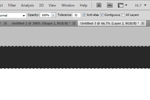
Now fill the layer with the foreground color.
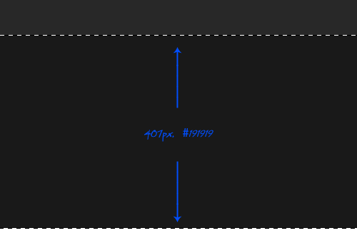
Now, we will have to setup the area for the slider. So again choose the selection tool and make a selection just below the header with a height of about 407px and make a new layer and fill the layer with the color #191919 using the bucket tool.
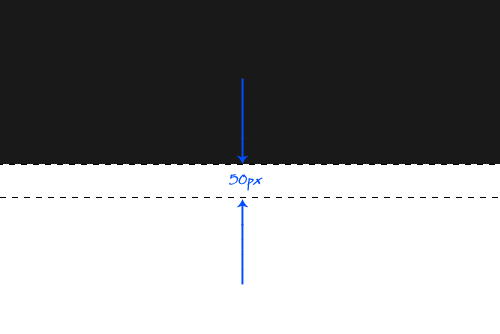
Just below the slider area, we have to fit the buttons for the different sliding images. So, make a selection with 50px just below the slider area and create a new layer fill it with the current foreground color.
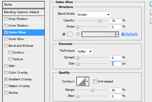
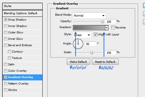
Now select this layer and change the blending options to the following values. (Right click on the layer and select blending options)
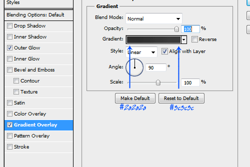
Set the gradient overlay to the given colors.
Now, we will have to make the menu bar. For that, choose the rounded rectangle tool and draw a bar just over the header and the slider from the center portion as shown below.

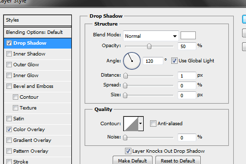
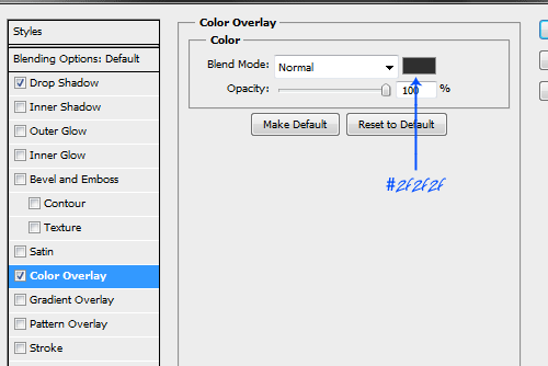
Now apply the blending options for the menu bar as shown below.
Now, you can add texts for the menu bar entry. You can even give a symbol for the home page as I have done here. (For that you can make use of the custome shapes in Photoshop).
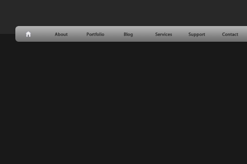
Inorder to get some nice effects for the text in the menu bar, apply the blending options to the text layers.
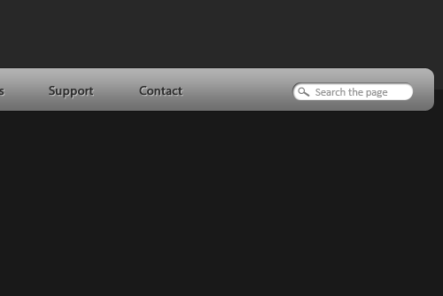
Now, we have to setup a nice search bar to the right of the menu bar. For that, Choose the rounded rectangle tool and draw a small search area in the right most portion of the menu bar. Insert the text ‘Search the Page’ inside the search area as shown below. You can even give a small lense icon from the custom shapes.
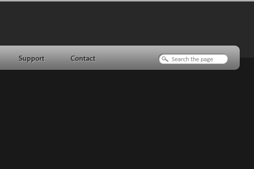
Apply the blending options to the search field to get a smart look.
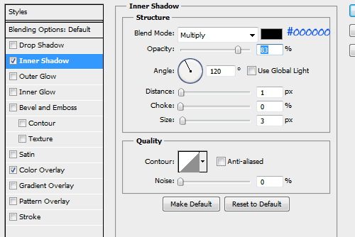
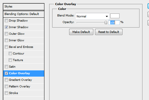
So this is how our search area will look like.
Now, we have to setup the slider and images. For that, choose a nice picture from your collection and insert into the slider area. Make sure that image width will not exceed the width of the webpage or width of the menu bar.
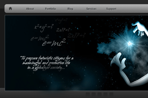
Below the slider area, we have to fix the buttons for the image slider. For that you can make use of the rounded rectangle tool and create 5 boxes as shown below.

Apply the following blending options to the boxes so that it will look quite impressive.
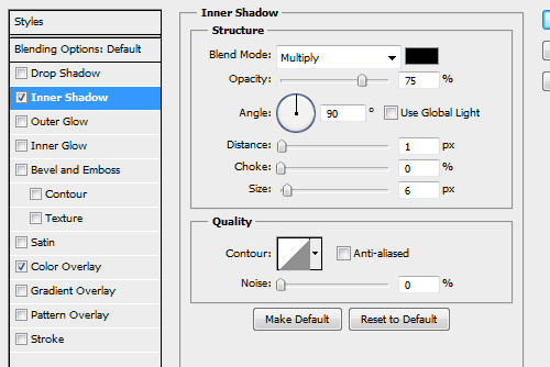
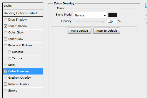
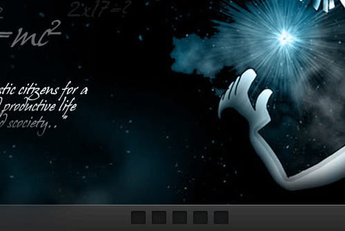
So, this is how our slider buttons will look like.
Now, we have to setup our logo . You can use any kind of font and color. I have used my name as the logo text and some example site name and used some nice gradients of blue in the blending options.

Now, below the slider panel, the content for the site starts. So, we can setup a small portion for the welcome note and a small download button. For that, make a selection as shown in the picture in the described height and fill the layer with the color #f0f0f0.
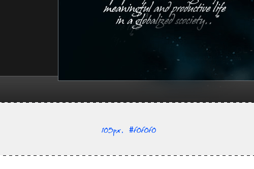
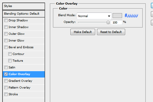
Now, we have to put a small division between the content area and this welcome-download area. For that, draw a small line throught the bottom line of the last layer and apply the below blending options.
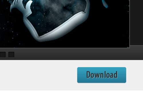
Now, we have to give a small download button. For that, choose the rounded rectangle tool and draw a small button as shown below. Apply the following blending options to that layer.
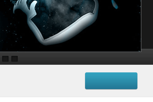
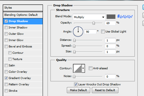
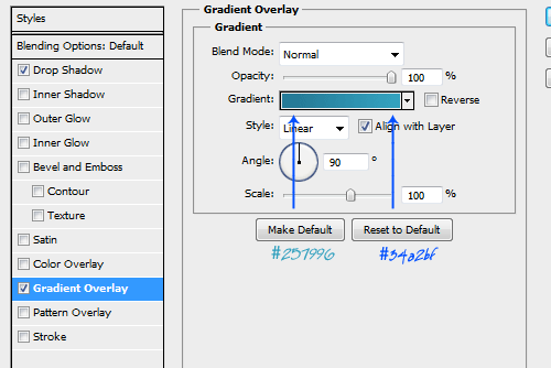
Put a text ‘Download’ and give the same layer styles as we have used in the menu bar text layers.
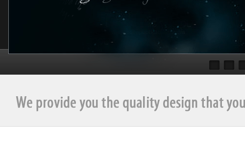
Now, we need to give the welcome text. I have used “Myriad Pro” font in “Condensed’ format and the font color is #979797.
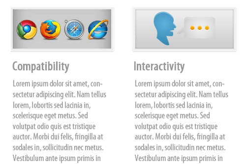
Below the welcome area, you can give your business details in 4 columns. It’s better to give a small thumbnail over each column as shown below.
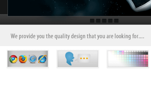
You can add heading and small texts in the columns.
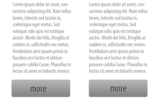
Below the texts, place a button for ‘more’. You can duplicate(ctrl+J) the download button and can place here with the menu bar layer style.
Now we have to end up the layout by the footer. This footer will have some additional links for your web page. So create a portion below the ‘more’ button as shown below.
You can place 5 different heading in that area.
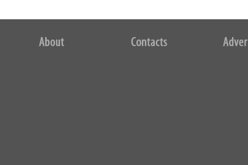
Place texts for each column and a font size slightly lesser than the headings. This is act as your additional links for the webpage.
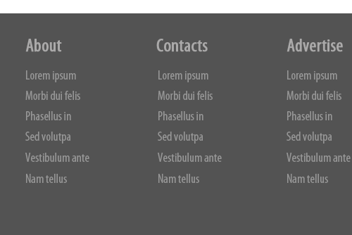
So, this is how our page will look like after all works. You can try with some other color combinations if you want.
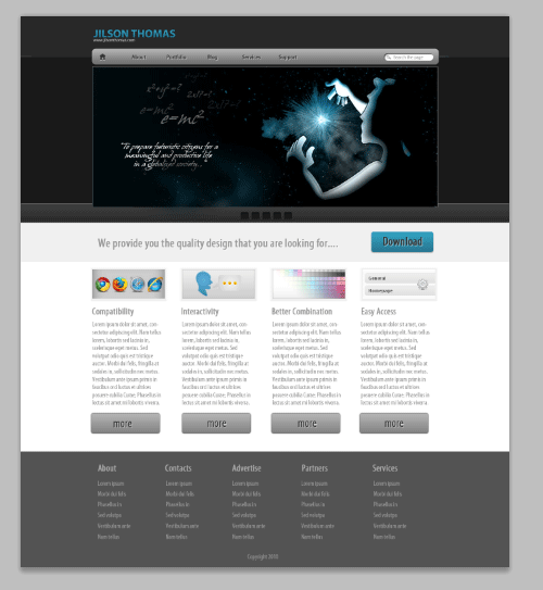
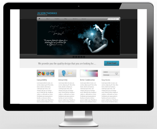
I hope you enjoyed the tutorial very much and looking forward to here from you. Have a nice time ![]()




2 Comments
Manik
11.20.2010
Nice tutorial Jillz. Like it!!!
Keep it up.
Brett Widmann
02.27.2011
This was a really nice tutorial. I love the final product!
There are no trackbacks to display at this time.