10 Great Examples of White Space in Web Design
Just like the silence between the notes in music, white space is the part intentionally left blank between elements in any kind of design. Although plenty of designers ignore it, white space is crucial in creating an effective layout, because without it, a design becomes cluttered, type becomes unreadable, and an entire arrangement of elements becomes confusing.
White space isn’t always taken literally as white — you can use any broad area of color or even a pattern to make certain elements stand out. The point is to reduce as much visual ‘noise’ so the viewer can take notice of the important parts of a design.
In web design, white space is a key principle in creating a clean and elegant layout. More often than not, blog templates with a simple and minimalistic layout are generally preferred over busy-looking themes. This is because too much stimuli can tire out readers’ eyes, which in turn can give them a less-than-favorable browsing experience. Which of course is what you don’t want to happen to your site visitors.
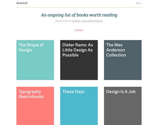
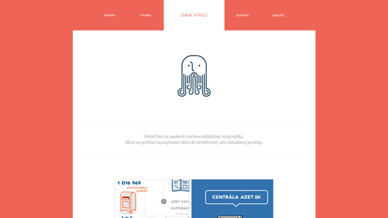
Here are a few examples of beautifully designed websites that effectively utilize the principles of white space. As you will notice, not all of these are rendered in black, white, or shades of gray. Some of them use color to make the site pop, but still retain that clean feel.
