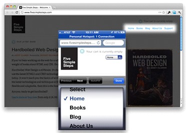
Convert Your Navigation Menu Into Mobile Dropdown Menu

When you’re creating a responsive website design, one main feature of your website that’s going to be totally affected is the navigation menu. One way for a nav menu to adapt to a shrinking real estate is by simply changing its orientation from the usual horizontal layout to the vertical layout.
But this method still ends up using the same amount of space and fills up the user’s screen. Another and much more efficient way for your nav menu to adapt to the limited space is by converting it into a mobile dropdown menu; one perfect example of this can be found in Five Simple Steps’ website.
Chris Coyier has created a tutorial that’ll show you how you can make your nav menu that behaves just like Five Simple Steps’. Although performing this method will result in one more tap that original (which goes against best practices of web design: less clicks/taps, the better), Coyier does point out that it is still better than making the user zoom in to tap on the right link.
All it takes to perform this tutorial is thru the usual HTML markup followed by the insertion of a bit of CSS code. He also addresses the potential problem regarding dynamic menus by making use of jQuery.
You can find Coyier’s tutorial in here together with the download link and demo preview.


