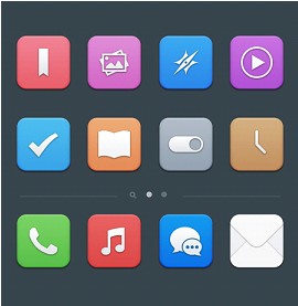
Flat Icon Design Inspiration For Mobile Phone
If you’re an iPhone user then you probably may have already heard about the change that is about to happen to the icon design of the forthcoming version of the iOS, which is iOS7.
Many have already expressed their thoughts about the new look and it is now clear that there is a divide between iPhone users. And then there are some who think that it is a good idea but the design could have been better. Well, I think I might have seen a few flat designs (most of them from Dribbble) that the third group of people might prefer over the official ones.

The first flat design I saw is created by Manu Gamero and it’s simply named Simple iOS. They look nice but aside from the phone and music player symbol, the rest have clearly already departed way too far from the original and don’t give you that certain feeling of familiarity anymore. It’s almost like your iPhone doesn’t look or even feel like an iPhone anymore.
The second comes from Ray, which I also found on Dribbble, and it’s called Flat icons of SmartisanOS (jff). Looks good too but then it also looks more like an Android user interface. Third one’s from Pixeden (again, from Dribbble) which is a little more original and with no fancy name, he just labeled it as Flat Design Icons Set Vol1. The last one I found is from Anton Kovalev of Russia over at Behance.net and it too doesn’t really have any official name, he just simply referred to it as iPhone Flat UI Concept.
Hope you enjoyed checking out all of the designs even though they’re only a few. Have a great and inspired day!


1 Comment
Alan Smith
07.24.2013
Now responsive web design makes all work easy for all kind of device where we want to see access website.
There are no trackbacks to display at this time.