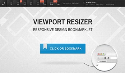
Viewport Resizer: Responsive Design Tester
One might think that the tasks and responsibilities of a web designer have now been made much easier because of responsive web design (RWD), but that is not quite true. Before RWD, it was just simply a matter of creating two versions of a website: mobile and desktop. But now that we have RWD coupled with the wide variety of screen sizes brought on by the different brands of mobile devices, web designers now have to deal with testing a website’s responsiveness based on all of the screen resolutions made available by all of these brands.
Fortunately, there are tools like the Viewport Resizer, developed by Malte Wassermann. This web design application is a browser-based tool that lets you see how a website will look like in a particular screen resolution.

Getting started to use this tool is fairly easy. Just save the bookmarklet by simply dragging it to your bookmarks bar, go to the page you want to test, click on your created bookmarklet and it will show you all the available resolutions or devices, choose the one you like to test the website on and the browser window will be resized accordingly.
Viewport comes in two configurations: advanced, which is the standard, and iOS, which simply supports resolutions used by iOS systems and devices. It supports all major browsers except IE (surprise, surprise).


