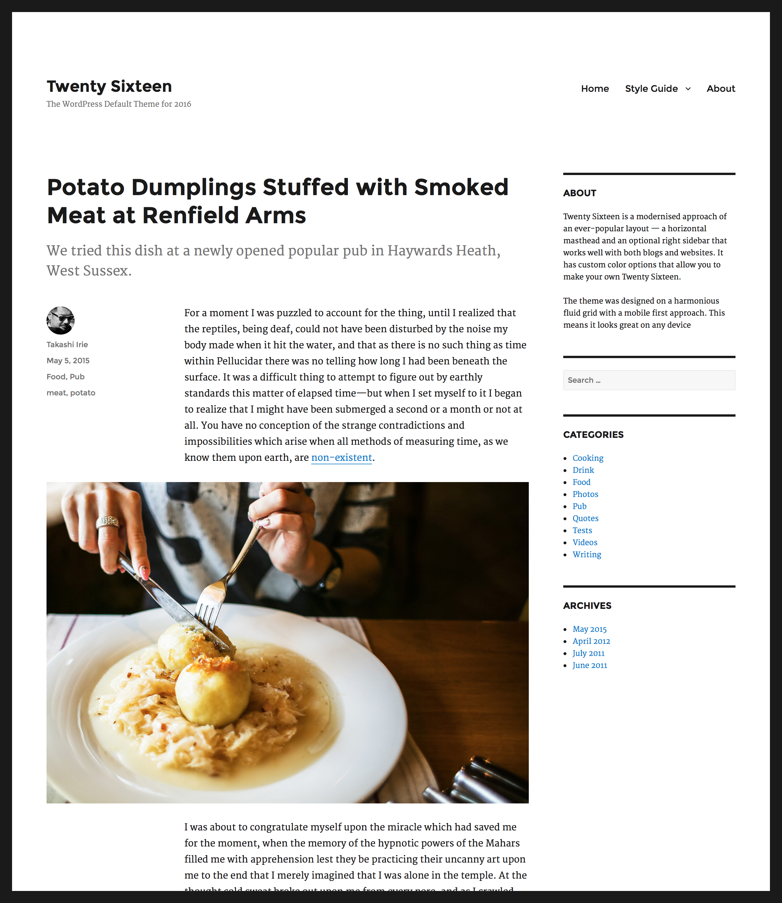
WordPress Twenty Sixteen Theme: First Look
After several months in development, WordPress 4.4 has finally come up with next year’s default theme, Twenty Sixteen, and here’s the first look at its great new layout!

Unlike its predecessors, Twenty Sixteen incorporates new and unique features into its overall classic design. While it’s not as modern-looking as Twenty Fifteen and still uses some elements from Twenty Fourteen, it still retains its fully responsive layout. According to Twenty Sixteen designer Takashi Irie, “Twenty Sixteen is a modernised approach of an ever-popular layout — a horizontal masthead and an optional right sidebar that works well with both blogs and websites. It has custom color options that allow you to make your own Twenty Sixteen. The theme was designed on a harmonious fluid grid with a mobile first approach. This means it looks great on any device.”
Together with teammates Ian Stewart and Samuel Sidler at WordPress, Irie will be developing the theme until its release, the date of which is still unannounced. The team is also looking for other designers, developers, and users for helping them out with patch testing, so if you think you have what it takes to make Twenty Sixteen even more attractive and functional, message the WordPress theme team in the gallery link below.
You can check out the gallery of Twenty Sixteen’s other looks here.


