CSS Drop Shadows Without Images
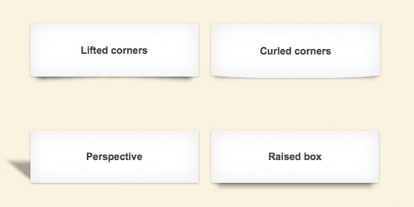
Drop-shadows are easy enough to create using pseudo-elements. It’s a nice and robust way to progressively enhance a design. This article CSS drop-shadows without images is a summary of the technique and some of the possible appearances.
There is no need for extra markup, the effect can be applied to a single element. A couple of pseudo-elements (.drop-shadow:before, .drop-shadow:after) are generated from an element and then pushed behind it. The pseudo-elements need to be positioned and given explicit or implicit dimensions.
The next step is to add a CSS3 box-shadow and apply CSS3 transforms. Different types of drop-shadow can be produced by varying these values and the types of transforms applied.
Requirements: Firefox 3.5+, Chrome 5+, Safari 5+, Opera 10.6+
Demo: http://nicolasgallagher.com/css-drop-shadows
License: License Free


1 Comment
Raghavendra
02.21.2011
cool effect man very nice.
Thank you
There are no trackbacks to display at this time.