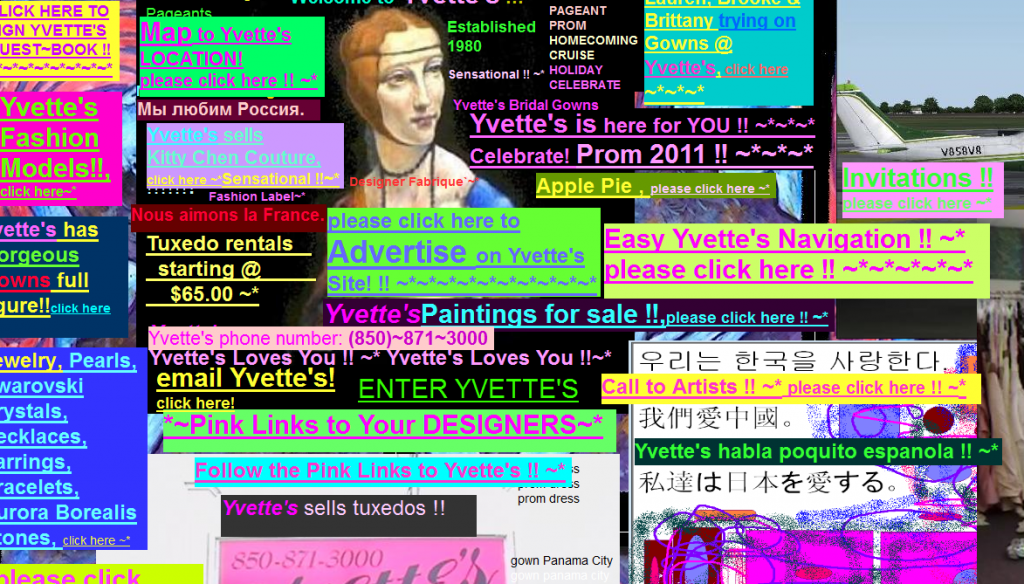
8 Bad Web Design Practices To Avoid
Designing for web holds plenty of opportunities to exercise and expand one’s creativity. But there are also common pitfalls that can lead to bad design, and often they come in the form of trends, or standard practices that just refuse to die.

Image source: Topdesignmag.Com
Here are 10 web design trends that would best be avoided, or if not, used sparingly.
1. Stock photos
It’s understandable that website owners can’t always afford to use their own images and photos for their layouts, so stock photos come to the rescue. It’s alright to use these, though there are plenty of instances when the designer and client choose to use photos that are obviously cut-and-dried from the image bank, and that’s when it becomes nasty.
TIP: Generic stock photos look cheap and even untrustworthy, because they’re usually found in shady landing pages and sales websites. One solution to this is to tweak the image with photo editing software, so it looks customized and less ‘fake.’
2. Web 2.0 graphics
Along with the rise of social media websites came an influx of Web 2.0 graphics, which can easily be identified by their bold colors, shiny elements, an attempt at 3D with shadows, bezels, and highlights, and an overall cartoony look. For a while they were considered one of the standards in web design, but now are also considered low-rent and tacky, particularly if they don’t really serve any purpose other than to decorate a web page layout.
TIP: Instead of resorting to Web 2.0 graphics, consider using more organic-looking images that serve more than just an aesthetic purpose for your design.
3. Hidden navigation
In an attempt to make a design look edgy and minimalistic, some designers go overboard and omit basic navigation components in their design. When you move from the homepage to the next page only to find that the only way out is to click on your browser’s ‘Back’ button, then you know it’s a miss.
This is also evident in HTML5 scrolling pages that allow the user to scroll continuously. When you’ve scrolled too far down and wish to return to a certain section, it’s convenient to have navigation elements that will easily take you there.
TIP: Design with the user in mind. Make sure that each section or page will provide them with a way to go elsewhere without having to return to the Homepage.
4. Skeumorphism
Popularized by Apple, skeumorphism is a design trend where graphic elements are designed as realistic objects to give off the impression of, well, realism. It used to be popular, until it became overused in practically every web design layout. And if you place several skeumorphic elements in one area, it’s easy for the entire design to look cluttered. Now, designers prefer flat or minimalist elements to convey the same idea that a skeumorphic design can.
TIP: You can’t go wrong if you simplify, and focus on functionality.
5. Pop ups (modal windows)
Pop-ups are annoying, period. To sidestep this, pop-ups that appear only when you click on certain links have been integrated into some designs. But there are also modal windows where you hover over an element and a pop-up window appears (I have one in my Yahoo Mail and it drives me nuts).
TIP: If you absolutely have to use modal windows, make sure it’s for an audience that will find it useful.
6. Excessive drop-down menus
Ever entered a site to see one global navigation link, and when you click it, out pours a huge menu with categories, subcategories and more subcategories under it? That’s category overkill, and it can overwhelm the user.
Although it’s advisable to streamline one’s design to make it viewer-friendly, piling up several categories and subcategories under one global menu can be confusing to your visitors. Think of it as putting tiny boxes into larger boxes, and into even bigger boxes that fill up a drawer that’s inside a closet.
TIP: It’s okay to place main categories where visitors can readily see them, then split the subcategories into more manageable sections.
7. 404′s
404′s can be mistakes, or temporary glitches while the website is being fixed or renovated. Still, having too many of them or having them for too long can cause viewers to lose interest in the site.
TIP: Address site issues promptly, or remove the page and its links altogether whenever possible.
8. Autoplay
Videos and audio on autoplay are annoying in a MySpace and Friendster kind of way.
TIP: Don’t do it.


